
zsty.us

Before / After · Case Study

Purple Pineapple Tech — a point-of-sale consultancy's brochure page rebuilt to run the first consult itself

  • Local Pro Services

A SoCal consultancy that sets up register systems for restaurants, bars and cafés had a one-page brochure site: good photos, a real since-2007 story, and nothing to do but read and email. Now the page does what they do on a first call — describe your operation in plain words and it specs the actual setup, with the reasoning attached.

The old site told you they understand how a Friday night runs. The new one proves it — describe your room and it specs the rig.
🔒purplepineappletech.oglife.app
jackiej.events — modern site

At a glance

What this rebuild covers.

  • App builds

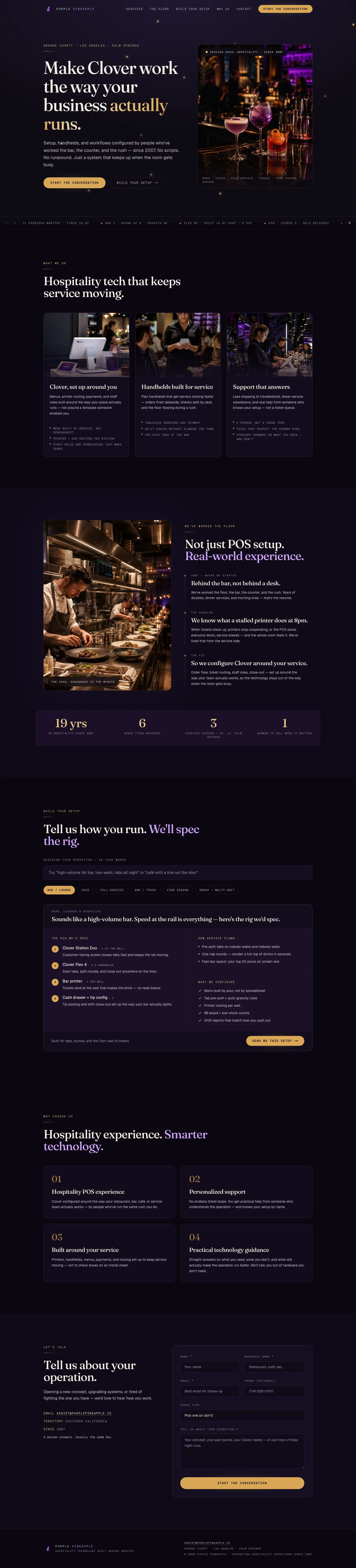
    A build-your-setup tool reads a plain-words description of an operation — 'high-volume tiki bar, two wells, tabs all night' — matches it to one of six venue types, and lays out the exact equipment it would spec, with counts and the reason for each piece.

  • Design

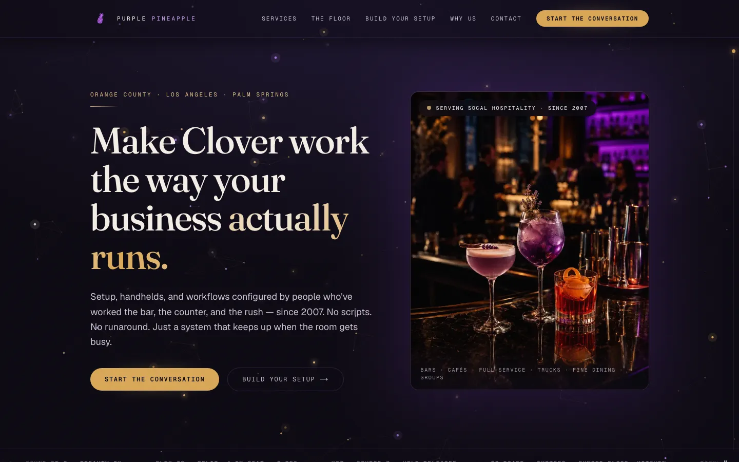
    The look is upscale-hospitality dark — a night-sky field, drifting embers, a dusk-to-candlelight wash as you scroll the services — built from a few kilobytes of owned code instead of background video, and it settles to a still frame for visitors who prefer less motion.

  • Speed

    The top of the page never waits on scripts to appear — it renders even with JavaScript switched off — and the animated backdrop is capped on phones so the effects never tax a small device.

  • Customer notifications

    Every inquiry is saved to a database the moment it arrives, with the visitor's venue type and setup selection attached — and if nothing could capture the lead, the form says so honestly and shows the direct email instead of pretending it sent.

  • Search visibility

    The rebuild deliberately stays hidden from search while the old site still answers on the business's own web address — one switch flips it discoverable the day the address moves over.

The pixel diff

Overview, then the walkthrough.

Left: everything the legacy site shipped — frozen in place. Right: an auto-scrolling tour of the rebuild, from hero to booking. No slider to fight with.

Before — the overview
🔒purplepineappletech.com
Before — the overview

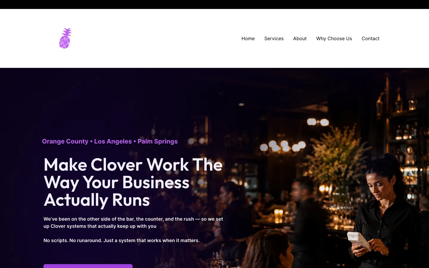
This is everything the legacy site had to offer above the fold. No pricing, no calendar, no booking — the funnel ended at a mailto.

After — scroll through what shipped
🔒purplepineappletech.oglife.app
After — scroll through what shipped

Auto-scrolls through the modern site so you can see the booking surface, the package grid, the pricing table, and the calendar inline — without leaving this page.

The four beats

Problem · Insight · Build · Outcome.

Scroll past the legacy frame. The four beats land in order. At the end, the modern site fades into the same window.

🔒purplepineappletech.com
Legacy
01 · Problem

A one-page brochure carrying a two-decade story.

The WordPress site had the right raw material — real photography, a genuine since-2007 hospitality story, a clear service area — flattened into a template one-pager where the only action was an email address. Nothing on the page did what the consultancy actually sells: reading an operation and specifying the right system for it.

02 · Insight

Their pitch is venue-specific judgment. Make the site perform it.

A consultancy that specs point-of-sale rigs differently for a tiki bar and a fine-dining room shouldn't have a site that treats every visitor the same. The Setup Builder turns the first consult into the homepage: describe the room, get the rig and the reasoning, and arrive at the contact form with the conversation already started.

03 · Build

Keep everything true, rebuild everything else.

Their photography and copy were carried over from the old site; the claims on the page are their claims. Around that: a dark hospitality design system, the six-archetype builder, and database-first lead capture on our hosting platform — then two adversarial review rounds, with every confirmed accessibility and performance finding fixed before handoff.

04 · Outcome

Live on a temporary domain, deliberately invisible to search.

The rebuild is live and verified end-to-end — a test lead submitted, stored, and cleaned up in production. Because the old site still answers on the brand domain, the new one ships behind a no-index gate; one flag flips it discoverable the day the domain moves. The owner's remaining call is the email sender for lead notifications — until then, every lead is safe in the database.

🔒purplepineappletech.oglife.app
Modern
For the technically curiousHow it was done
  1. 01

    Where it started

    The old site was a one-page WordPress brochure built on a page-builder theme: anchor links to five sections on the same page, good photography locked in a template layout, and an email address as the only next step. The story was real — hospitality people, on the job since 2007, covering Orange County, Los Angeles and Palm Springs — but the page just told it; it didn't do anything.

  2. 02

    Keep everything true

    The rebuild's raw material is theirs: the photography was pulled from the old site at full resolution, the copy and claims carried over, and nothing was invented. What changed is the frame — a dark hospitality design system with a night-sky hero, ember drift, and a scroll wash that moves from dusk to candlelight down the services arc, all owned code with no background video to download.

  3. 03

    The Setup Builder

    The consultancy's real product is judgment — a tiki bar and a fine-dining room need different registers, different handhelds, different printer routing. So the site performs that judgment: a free-text box scores the visitor's description against six venue archetypes, each carrying a real equipment rig with counts and per-item reasoning, a service-flow story, and the configuration list they'd actually set up. A match prefills the contact form with the rig snapshot; a description the scorer can't confidently read gets an honest 'tell us more' instead of a forced guess.

  4. 04

    Lead capture that fails honest

    Inquiries are validated, guarded against bots by a trap that doesn't punish browser autofill, and written to a managed database first, with an email leg on top. If neither rail captured the lead, the form returns an honest failure with the direct email — it never claims success when nothing was saved. Each lead keeps its source and any builder selection as structured data.

  5. 05

    Reviewed, then shipped

    Two adversarial review rounds ran before handoff. An accessibility pass found seven issues — keyboard control for the moving ticker, contrast, focus rings, screen-reader status on the form's success state — all fixed and re-verified in a real browser. A correctness-and-performance pass then made the first paint independent of scripts, capped the effect surfaces on phones, shrank the social-share image, and closed a bot-trap edge that could have silently dropped real leads. The site is live on a temporary address with a production-verified lead round-trip, hidden from search until the brand domain moves over.

Before

  • WordPress one-pager (Astra/Spectra)
  • Anchor-link nav, no lead capture beyond email
  • Good photography stuck in a template layout

After

  • Modern app framework
  • managed database
  • Setup Builder — free-text venue matcher with real hardware specs
  • Validated, honeypot-guarded lead capture — database first
  • Indexing gate for the temporary domain

What changed, with evidence

Agent backbone

The Setup Builder: the first consult, on the page

A free-text box — 'describe your operation, in your words' — feeds a keyword-and-tag scorer that matches the description to one of six venue archetypes: bar/lounge, café, full-service restaurant, QSR/food truck, fine dining, or a multi-unit hospitality group. Each archetype carries a real recommended rig (which Clover hardware, how many, and why), a service-flow narrative, and the configuration list the consultancy would actually set up. A matched result prefills the contact form with the venue type and rig snapshot; a description the scorer can't read gets an honest 'tell us more' line instead of a forced guess.

Before
A brochure that said 'we know hospitality' and left the rest to an email.
After
A page that reads how your room runs and specs the rig — then hands the conversation to a human.
  • Six venue archetypes with real hardware, counts, and per-item reasoning
  • Unmatched descriptions get an honest read line — never a fake match
  • Builder selection rides along with the lead as structured data
Design

Upscale-hospitality dark, without paying for it in load time

Constellation night-sky hero, ember drift, and a dusk-to-candlelight wash that follows you down the services arc — all owned code, no background video. The above-the-fold content deliberately never waits on JavaScript: entrance animations are CSS-only and the hero renders with scripts disabled, the effects canvas is capped to roughly one viewport on phones, and every effect settles to a still frame for visitors who prefer reduced motion.

  • Hero verified to render with JavaScript disabled
  • Effects canvas capped on phones instead of painting multiple viewports
  • Reduced-motion visitors get the same content, still
Retention

A lead form that refuses to lie

Submissions are validated, honeypot-guarded against bots without punishing browser autofill, and written to a managed database first, with an email leg layered on top. If neither the database nor the mail leg captured the lead, the form returns an honest failure with the consultancy's direct email — it never claims 'sent' when nothing was saved. Every lead keeps its source and, when the builder was used, the full rig snapshot.

Before
Contact meant finding the email address in the footer.
After
Structured leads with venue context, captured even when one rail is down — and an honest error when both are.
Agent backbone

Reviewed like an adversary before handoff

Two independent review rounds ran before the site was called done. An accessibility pass surfaced seven findings — keyboard control for the moving marquee, contrast, focus rings, screen-reader status on the form's success state — all fixed and re-verified in a real browser. A correctness-and-performance pass then tightened the largest-paint path, capped effect surfaces, shrank the social-share image, and closed a bot-trap edge case that could have silently dropped real leads.

← All rebuilds

Purple Pineapple Tech — a point-of-sale consultancy's brochure page rebuilt to run the first consult itself — zsty.us