zsty.us

Before / After · Case Study

Brubaker's Brutal Barbershop — from a booking-app listing to a real shop site in one sitting

  • Local Pro Services

A one-chair Montana barbershop had no website — just a listing on a booking app and a 300-year-old family crest. One working session later it has a live site with a look built from that crest, a build-your-visit checkout that keeps the shop's cash-first ways, and the search plumbing to be found by locals.

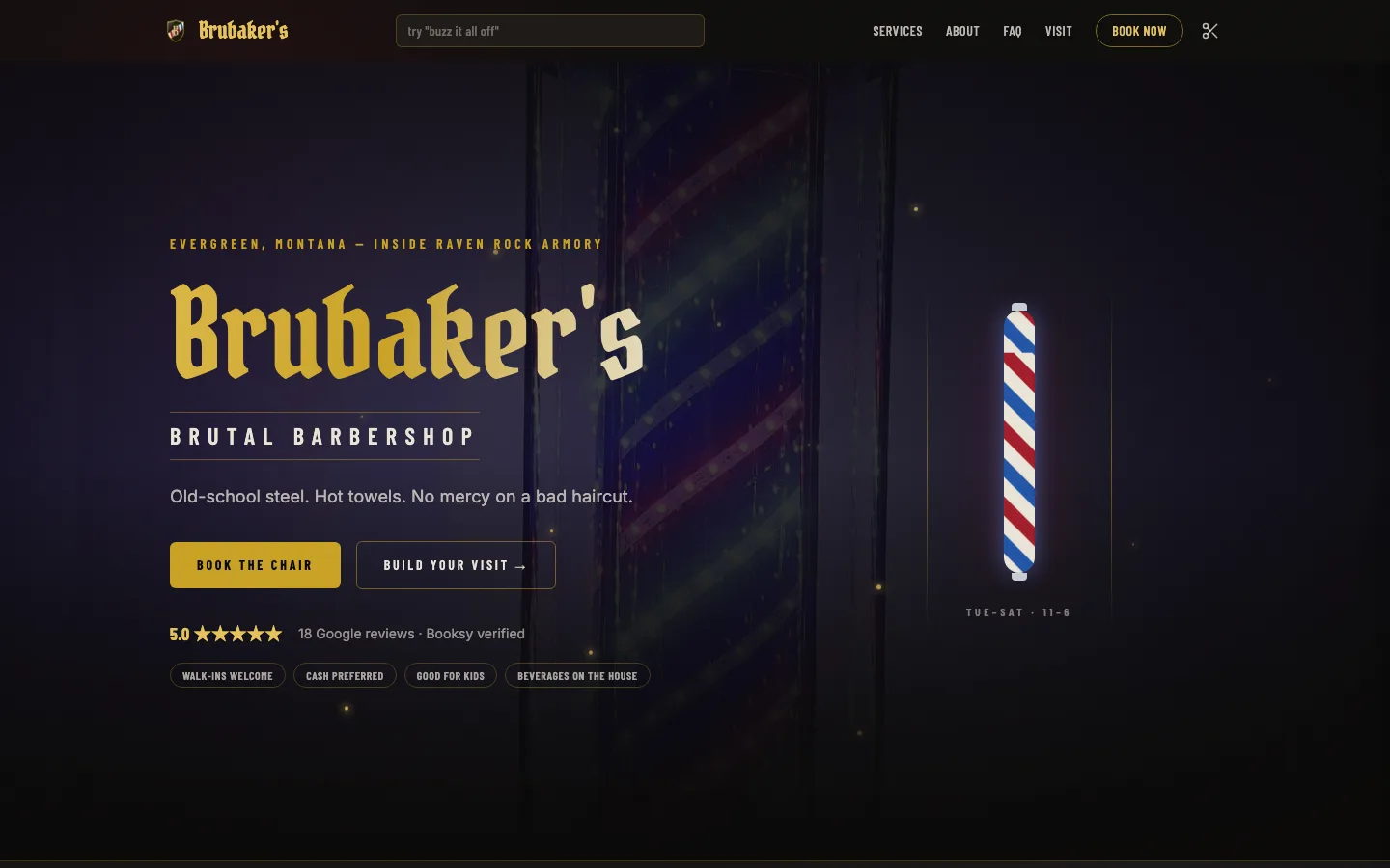
The design brief was his actual family crest — blackletter, smoke, crimson, and gold, not a template with a scissors icon.
🔒brubakersbrutalbarber.oglife.app
jackiej.events — modern site

At a glance

What this rebuild covers.

  • Design

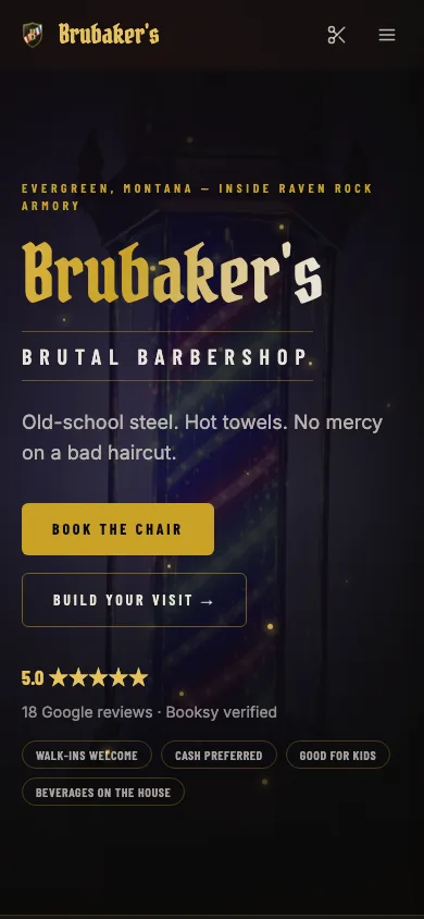
    The whole look was drawn from the family crest hanging in the shop — blackletter lettering and a hand-built icon set instead of a barbershop template with a scissors clip-art.

  • Theme & color

    Smoke, crimson, and gold pulled straight off the crest give the site a heavy, heraldic metal feel that matches the shop's actual clientele.

  • Selling & payments

    Customers build their visit from real services at real prices and submit it — cash-preferred by design, so the shop takes money the way it always has, with no card fees bolted on.

  • Security

    Visit requests land in a sign-in-protected admin only the owner can open, so customer details never sit on a public page.

  • Search visibility

    Eight per-service pages, an FAQ, and structured business data with services, reviews, and location give a one-chair shop the search footprint of a franchise.

Receipts — measured

Numbers that moved.

0
Sessions from zero to live
was 0
0
Per-service SEO landing pages
was 0
19 open
Adversarial-review findings fixed pre-handoff
was 19 open
  • No website → live in 1 session
  • 8 service pages built for local search
  • Cash-first checkout — no forced card fees
  • 19 issues found and fixed before handoff

The story

Problem · Insight · Build · Outcome.

  1. 01 · Problem

    A barbershop with a crest, a chair, and no web presence.

    Brubaker's Brutal Barbershop operates inside Raven Rock Armory. Discovery ran through Booksy or word of mouth; there was no site, no service pages, nothing a search engine could rank for 'barber near me' in his corner of Montana.

  2. 02 · Insight

    The brand was already designed — 300 years ago.

    The family crest carried the whole visual identity: blackletter, heraldry, iron and gold. Building from it produces a site no template marketplace could — and the metal aesthetic is exactly right for the shop's actual clientele.

  3. 03 · Build

    One session: design system, cart, catalog, admin, SEO layer.

    Next.js 15.5 + Tailwind v4 + Drizzle on Railway Postgres. Crest-derived design system, 'Build your visit' cart, Booksy-mirrored catalog, cookie-auth order admin, 8 service landing pages, FAQ, HairSalon @graph, IndexNow. Then an adversarial review pass — 19 findings, all fixed — before handoff.

  4. 04 · Outcome

    Live on a first-party subdomain, cash flow unchanged, discovery transformed.

    brubakersbrutalbarber.oglife.app is live on the portfolio's own platform (a dedicated domain is one DNS change away). The shop's cash-preferred model is untouched — what changed is that the shop is now findable, structured, and bookable.

For the technically curiousHow it was done
  1. 01

    Where it started

    There was no website at all. Discovery ran through a Booksy listing or word of mouth, walk-in pricing lived on a wall, and nothing existed for a search engine to rank for 'barber near me' in his corner of Montana. The only brand asset was the family heraldic crest hanging in the shop.

  2. 02

    The design brief was 300 years old

    Instead of a template, the design system was derived from the crest itself: a blackletter display face, a smoke / crimson / gold palette, and a custom vector icon set. The site reads like the brand because it literally is the brand — the same mark on the wall, carried across every page.

  3. 03

    The build — one session

    A hand-built site on our hosting platform with a managed database behind it. The centerpiece is a 'Build your visit' cart shaped to how the shop actually takes money: customers assemble services and submit, cash-preferred, with no card processing forced into a shop that doesn't want the rail or the fees. The service catalog mirrors his Booksy services so pricing never forks, and submitted visits land in a sign-in-protected admin the owner controls.

  4. 04

    The search layer

    Under the metal aesthetic is local-SEO plumbing a one-chair shop never gets: structured business data describing the shop, its full service catalog, reviews, and location; eight per-service landing pages; an FAQ surface; and automatic pings to search engines the moment a deploy goes out.

  5. 05

    What shipped

    Before handoff, an adversarial review pass surfaced 19 findings — copy overclaims, accessibility gaps, structured-data errors — and every one was fixed in the same session. The site went live on a first-party subdomain (a dedicated domain is one DNS change away), the shop's cash-first model untouched; what changed is that the shop is now findable, structured, and bookable.

Architecture

Old stack
  • Booksy listing
  • No site
  • No schema
New stack
  • modern web framework
  • Build-your-visit cart (cash-preferred)
  • Booksy-mirrored catalog
  • 8 service landing pages
  • HairSalon @graph + IndexNow
  • managed app hosting

What changed, with evidence

Design

A design system derived from the client's real heraldic crest

No barbershop template. The palette (smoke / crimson / gold), the Pirata One blackletter display face, and a custom vector icon set were all derived from JohnMark's actual family crest — the same mark hanging in the shop. The site reads like the brand because it is the brand.

Before
Brand existed as a physical crest and a Booksy avatar.
After
A coherent heraldic design system across every page.
  • Pirata One blackletter + smoke/crimson/gold tokens from the crest
  • Custom vector icon set, not a stock icon pack
Design

'Build your visit' — a cart shaped to how the shop actually takes money

Customers assemble services into a visit and submit — cash-preferred, with no card processing forced into a shop that doesn't want the rail or the fees. Orders land in a cookie-auth admin. The catalog mirrors his Booksy services so pricing never forks.

Before
Booking meant navigating Booksy's chrome; walk-in pricing lived on a wall.
After
A branded visit-builder with real prices, orders visible in a shop-owned admin.
Agent backbone

Local-SEO plumbing a one-chair shop never gets

HairSalon JSON-LD @graph with OfferCatalog, reviews, and geo; eight per-service landing pages; an FAQ surface; and IndexNow pings on deploy — the structured-data depth of a franchise, on a one-chair shop inside an armory.

  • HairSalon @graph: OfferCatalog + review + geo nodes
  • 8 service landing pages + FAQ
  • IndexNow ping wired into the deploy
Retention

19 findings fixed before the client ever saw it

An adversarial review pass ran before handoff and surfaced 19 findings — copy overclaims, a11y gaps, schema errors — all fixed in the same session. The client received a reviewed site, not a first draft.

← All rebuilds

Brubaker's Brutal Barbershop — from a booking-app listing to a real shop site in one sitting — zsty.us